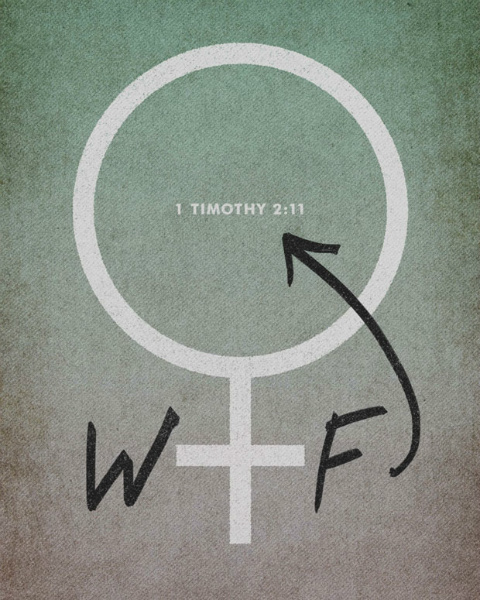
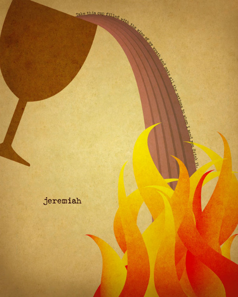
After I first came across Jim LePage’s Word series online, I couldn’t stop thinking about the stunning, poster-style images he created for each book of the Bible. Jim is a graphic designer from St. Paul, Minnesota, who, in addition to doing freelance design work, serves as Design Manager at Woodland Hills Church, where Greg Boyd is a pastor. What I love most about the Word series is that it manages to capture some of the most beautiful, compelling, bizarre, troubling, violent, and redemptive images from the Bible in a way that, as we talked about on Monday, honors the Bible for what it is, not simply what we want it to be.
I caught up with Jim and asked him a few questions about this fascinating project.
Rachel: What inspired you to take on the Word project?
Jim: I've always thought the Bible was a powerful book and contained an amazing story of God's pursuit of humanity. But in all honesty, whenever I tried to read it, I got bored really quickly. I'd make all types of different efforts to read the Bible more, but inevitably I'd always give up, because it seemed boring and I'd rather watch TV. It's a frustrating feeling to know that this book shares such an incredible story that I just couldn't seem to tap into.
Eventually, I decided to try combining something that felt boring – Bible reading – with something that I was passionate about – design. You can find out more about how the project began on my site.
It must have been a challenge to take an entire book of the Bible and try to capture it in a single image. What was your process like? How did you decide which direction to go creatively with each book?
Although some of the designs ended up that way, I never intended to capture each book with a single image. Like I mentioned, I'd tried and failed plenty of Bible reading efforts, so I wanted to keep the scope of the project pretty simple so I'd stick with it. I knew that capturing every book in one design would be a little too daunting, so instead I set out to find one passage or verse in the book that stood out to me visually and create a design based on that.
The process usually involved reading or skimming the book and noting any verses or passages that jumped out to me visually. Then I'd read up a little on the background of the book on Wikipedia (again, keeping it simple). After that, I'd look through the passages I'd written down and pick the one that I felt had the best visual potential.
In your designs, you aren’t afraid to highlight some of the strange/disturbing/quirky elements of Scripture. (I’m thinking especially of your interpretation of Psalms, Malachi, Titus, 1 Timothy, and others.) I love this because it reminds me of my own journey through Scripture, which often involves surprise, confusion, frustration, and laughter. Why feature these lesser-known (or lesser-emphasized) themes rather than the more traditional, “inspirational” themes?
The God I read about in the Bible is beautiful, but also surprising, creative, offensive, risky and oftentimes seems a little crazy. I want my art (and the reflections I did for each design) to represent all of that. As an artist who is Christian, it seems to me that most Biblical art seems to value propriety over honesty. In other words, it's better for Biblical art to be "nice" than honest. That seems wrong and boring. I wanted to value honesty above propriety and I think that led me to some strange and lesser explored parts of scripture. For me, if I didn't explore those passages, it would have felt dishonest. Oftentimes, being honest in the design led me to a greater and deeper appreciation of the passage and I ended up seeing it in a completely different light. You can find out more about what I learned from the project in my post "An Idiot's Guide to Reading the Bible."
How can people get your prints?
I've got prints available for all of my Word designs. I have 2 online shops set up: one for the U.S. and Canada and one for international folks. I did my best to make prices as reasonable as possible. You can find more information about ordering prints on my site.
Interestingly, I always thought this would just be an online project and never intended to make prints, but I kept getting requests for them so I figured I'd make them available and maybe sell a few. I've been surprised to see how many folks are actually ordering the prints. In fact, last December I said I'd donate all proceeds from sales of my prints to help low-income and homeless families in St. Paul (where I live). I threw out what I thought was a lofty goal of raising $600. By the end of the month, I was blown away to see that $1000 had been raised. I think that is the coolest thing I've seen come out of this project so far.
Now that you've finished your Word series, are you planning on doing another project?
Along with Troy DeShano (StrongOdors), I'm currently working on (and super excited about) a new collaborative design project, called "Old & New." Different artists and designers will create visual representations of Bible verses and passages. My goal is to have a wide variety of contributors – from Evangelical Christians to Atheists to those who may have been burned by the church. My Word project had only one voice – me. With this new project I hope to have many. The artists lined up so far has some of my favorite designers out there. Every single one of them is at least 10 times as talented as me. The goal is to launch it in February or March and I'll be posting updates about that project on my site as it gets closer to launching.
Check out the rest of Jim’s Word designs:
Old Testament - Pentateuch, Historical Books, Wisdom Books, Major Prophets, Minor Prophets
New Testament - Gospel & Acts, Easter, Pauline Epistles, General Epistles, Apocalypse
(You can also connect with Jim on Facebook and Twitter.)
So, do you have a favorite? (I'm partial to 1 Timothy, for obvious reasons, and to James, because it's probably my favorite book of the Bible.)
© 2012 All rights reserved.
Copying and republishing this article on other Web sites without written permission is prohibited.


